


Fonts Art - Keyboard Fonts
4.58.74K Reviews
App Specs
- Version
- 2.84.8
- Updated On
- License
- Free
- Downloads
- 10,000,000+
- Developer
- AIBY Inc.
- Categories
- Personalization
- Platform
- Android, iOS
Screenshots
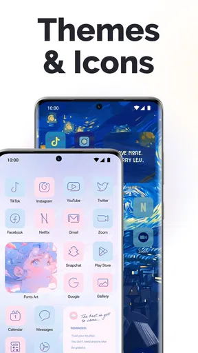
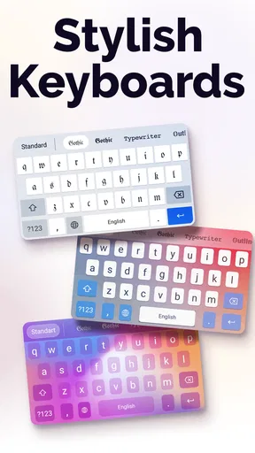
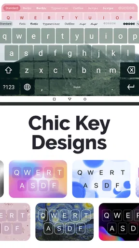
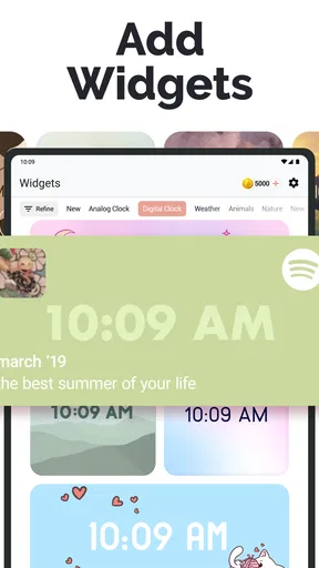
 Analysis by AppCompare
I like changing the look of a message without turning the whole phone into a customization project, and that is where Fonts Art - Keyboard Fonts makes sense. It is a personalization app from AIBY Inc. built around decorative text and keyboard styling. The appeal is immediate: choose a look, type a short phrase, and give a caption or chat message a more individual feel. I see it as a small creative tool, not a replacement for the standard keyboard or a way to redesign every app on a device.
How it feels to use now
The app is free to install, with optional in-app purchases ranging from $0.99 to $49.99 per item. Its current version is 2.78.8, and it has been available since July 1, 2020. That history makes it a more established option than a brand-new font utility, though a version number alone cannot tell me exactly which changes arrived along the way. The practical question for a new user is simpler: can I find a style quickly, and will it suit the place where I want to use it?
Fonts Art has a 4.5 average from around 414,000 ratings and has been installed over 10 million times. It is rated for everyone, and its minimum operating-system requirement is version 10. Those figures suggest a large audience for decorative typing, but popularity is not the same as a perfect fit. I would choose it for playful, occasional personalization; someone who wants a plain, fast keyboard above all else may be happier with the one already on their phone.
Setup and the first useful choice
When I first downloaded Fonts Art - Keyboard Fonts, I was pleasantly surprised by its clean and intuitive interface. Setting it up was a breeze. All you need to do is follow a few simple steps to enable the keyboard on your device. Once that's done, you're ready to start experimenting with a plethora of font styles.
The app’s design is sleek, and navigating through the options feels natural. I didn’t encounter any hiccups or confusing instructions, which is always a plus.
There is one decision worth making before switching keyboards: do you want a different appearance for a single post, or do you want decorative typing ready whenever you message? For the first, previewing and copying a short line can be a lower-commitment workflow than leaving a novelty keyboard active. For the second, enabling it makes sense, but I would still keep the regular keyboard easy to select for passwords, addresses, and longer practical messages.
Choosing styles without losing the message
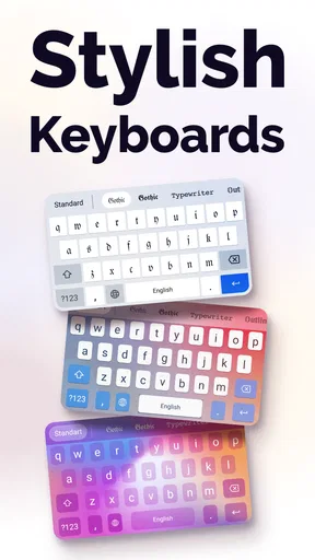
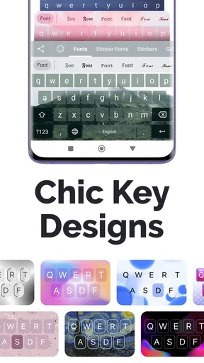
One of the standout features of this app is the sheer variety of fonts available. Whether you're feeling quirky, elegant, or bold, there’s something for everyone. The app offers a mix of free and premium fonts. While the free selection is robust, the premium fonts are worth the investment if you’re someone who loves to switch things up frequently.
Worth Reading Before You Choose

Flipboard Shows What News Apps Must Do Beyond the Feed

Switching to Android Auto Means Rethinking Your Driving Routine

Google Calendar Makes a Crowded Week Easier to Manage
Ludo King Makes the Most of the Minutes Between Plans

Baby Panda World Brings Quick Play to Modern Phones, but Its Game Library Feels Busy

ESPN’s Live Game View Makes Following Close Games Easier
Another cool feature is the ability to create your own font style. Yes, you read that right! You can actually customize your own font and use it within the app. It’s a fun way to add a personal touch to your messages.
My most useful rule is to test a style on the actual destination before writing a long caption around it. Decorative characters can look striking in a preview but feel less readable when several lines are stacked together. I’d reserve the more elaborate choices for a name, a short greeting, or a few words of emphasis, then use ordinary text for the explanation. That contrast makes the distinctive part feel intentional rather than making every sentence compete for attention.
This also helps when sharing across different social apps. A font treatment that looks good in one composer may not have the same visual effect in another place or on another person’s screen. I treat the preview as a way to narrow down options, not as a guarantee that every recipient will see precisely the same design. If a post needs to be immediately clear to everyone, simpler text is the safer choice.
Everyday use across messages and social posts
One thing I appreciated about the app is its seamless integration with various messaging platforms and social media apps. Whether you're on WhatsApp, Instagram, or Facebook, using a unique font is as easy as switching your keyboard. The app doesn’t slow down your device, which was one of my initial concerns.
There’s also a nifty feature where you can preview how your text will look in different fonts before you even switch your keyboard. This saves a lot of time and helps you pick the perfect style for any mood or occasion.
A realistic use for me is drafting a birthday message while waiting for a friend: I can try a few treatments on the person’s name, keep the rest of the greeting readable, and decide whether the result feels warm or overly decorative before sending it. The same approach works for an Instagram caption when I want a short opening phrase to stand apart from the main text. I would not use a novelty style for a work update or anything where scanning quickly matters more than personality.
For creators who post often, a small repeatable routine is more useful than changing styles on every line. I’d pick one treatment for a recurring kind of post, such as a short heading, and keep body copy plain. That gives a profile a bit of visual consistency without forcing every caption into the same ornate look. If the style becomes tiring after a few posts, switching back is easy; there is little reason to treat a font choice as a permanent branding decision.
Where it sits among keyboard alternatives
The usual alternative is the phone’s built-in keyboard, which is generally the straightforward choice for everyday typing. It avoids the extra step of exploring decorative options and is better suited to long messages, forms, or people who rarely care about typography. Fonts Art fills a narrower role: it makes expressive text easier to try without requiring a separate design program for every short phrase.
A graphics or photo-editing app is a better option when the text must be placed precisely in an image, matched to a layout, or exported as part of a designed post. Fonts Art is more convenient for text entered directly into messages and social captions, but it is not the same as laying out a poster. I would choose based on the finished result I need: quick expressive typing here, detailed visual composition elsewhere.
The app’s category is personalization, and that description fits its strongest use: adding character to communication rather than improving typing speed. If you mainly want predictive typing, multilingual input, or a keyboard built for accessibility, I would compare dedicated keyboard options instead of assuming decorative fonts will solve those needs. The best reason to install this one is that you genuinely enjoy styling short text.
Why I keep coming back
The main reason I keep using Fonts Art - Keyboard Fonts is its ability to make everyday communication a bit more exciting. There’s something delightful about sending a message that stands out in a sea of standard fonts. It’s like adding a personal signature to your digital interactions.
In addition, the app is regularly updated with new fonts and features, which keeps things fresh and exciting. The developers seem to be actively listening to user feedback, which is always a reassuring sign.
For existing users, the current version gives a concrete point of reference, but I would not infer a particular redesign or feature change just from the version number. The useful way to judge an update is to open the app and see whether the styles and controls you rely on still suit your routine. If you already have a small set of favorites, there is no need to browse everything again each time; a quick preview of a new option is enough to decide whether it earns a place in your rotation.
One practical trade-off is the keyboard itself. Any time I enable an additional keyboard, I think about when I actually need it and whether I am comfortable switching between it and the default. I use decorative typing for casual social messages, then switch back for sensitive or utilitarian text. That habit keeps the novelty useful without making the special keyboard the automatic choice for every task.
Limits, purchases, and who should pass
While I’ve had a positive experience overall, there are a few areas where the app could improve. Sometimes, the font selection can feel a bit overwhelming, especially if you’re indecisive like me. A more streamlined browsing experience with categories or filters could help users find their desired style more quickly.
Also, it would be great to see more bundled features in the free version. While the premium fonts are fantastic, expanding the free offerings would make the app accessible to a wider audience.
Because paid items are available at different price points, I would explore the free styles first and only consider a purchase after finding a look I expect to use repeatedly. A one-off novelty is easy to enjoy without paying for more options; someone who likes changing their font often may see more value in expanding the selection. I would not treat every premium choice as essential, since the point is personal expression and a free style may already work for a particular caption.
I would skip Fonts Art if I dislike switching keyboards, rarely post or message in a decorative style, or need every line to be maximally legible. It is also not my first pick for text embedded in a carefully composed image, where a design editor gives more control over spacing and placement. Those are not failures so much as boundaries: this app is most rewarding when the task is short, informal, and visual.
What I would watch for as I keep using it
With a product that has been around since 2020 and is now at version 2.78.8, continued changes are part of its story, but I separate that fact from guesses about what might come next. I would watch for whether browsing becomes easier, whether the balance between free and paid styles feels fair for my own use, and whether the keyboard remains comfortable for quick switching. Those are the details that would affect my day-to-day experience more than a growing collection of styles alone.
If you are deciding whether to try it, start with one concrete task: make a short caption or greeting, preview a few styles, and see whether the result still reads clearly in the app where you plan to send it. That small test answers the main questions—whether the look suits you, whether the workflow feels convenient, and whether the free selection is enough—without turning setup into a commitment.
Overall, Fonts Art - Keyboard Fonts is a delightful app that adds a touch of flair to your texting game. It's easy to use, packed with features, and offers a unique way to express yourself through typography. If you're someone who loves to stand out or just wants to have a little fun with fonts, I highly recommend giving it a try. You won't be disappointed!
Pros
- Wide variety of stylish fonts available.
- Easy integration with messaging apps.
- User-friendly interface enhances experience.
- Supports multiple languages seamlessly.
- Customizable keyboard themes and colors.
Cons
- In-app purchases can be frequent.
- Limited free font options available.
- Occasional ads may disrupt usage.
- Requires access to personal data.
- Some features need internet connection.
FAQs for Fonts Art - Keyboard Fonts
What is Fonts Art - Keyboard Fonts?
Fonts Art - Keyboard Fonts is an app that allows users to customize their typing experience with a variety of unique and stylish fonts. It enhances the appearance of text across different apps, making communication more expressive and fun. The app is available for both Android and iOS.
How do I install and use Fonts Art - Keyboard Fonts?
To install Fonts Art - Keyboard Fonts, download it from the Google Play Store or Apple App Store. Once installed, follow the in-app instructions to enable the keyboard in your device settings. You can then switch to the Fonts Art keyboard while typing in any app to access the custom fonts.
Is Fonts Art - Keyboard Fonts free to use?
Fonts Art - Keyboard Fonts offers a free version with basic features. However, it also provides in-app purchases or a subscription model for access to premium fonts and additional customization options. Check the app's store listing for detailed pricing information and available features.
Does Fonts Art - Keyboard Fonts affect my device's performance?
Fonts Art - Keyboard Fonts is designed to run smoothly on most devices. However, using a third-party keyboard can sometimes affect battery life or performance, depending on your device's specifications. Ensure your device is updated and check for any app-specific issues if performance concerns arise.
Is Fonts Art - Keyboard Fonts safe and secure?
Fonts Art - Keyboard Fonts prioritizes user privacy and security. When enabling any keyboard app, it's important to review the permissions it requests. The app should not collect personal data without consent. Always download from official app stores to avoid security risks associated with third-party sources.


